
In my lino prints, I explored a floral theme and experimented with colours and shape. Which came out very successful and enabled me to improve my lino skills, also to discover a new technique to manipulate this method of printing.
Firstly, I used a scalpel to cut off a slight edge, to change the square lino block. I did this as I wanted to experiment with my technique of cutting the block which can be difficult to do. Also, I wanted to develop the use of shape more on my print. Then, I printed a few to act as a background block of colour, to then print my design on top. I wanted to do a two colour print, therefore, I choose to do the back colour and then my design in another. I did around five colour background prints, then I left them to dry so the next print could be applied effectively on the top.

I found the final outcome really successful, the colour scheme was effective for boldly enhancing the design. Also the ink was well transferred which made the overall look professional and neat. I wanted to play around with the use of composition so instead of the traditional idea of lining up the prints accurately, I wanted to have the floral design slightly off the back colour. I found it improved the interest in the print, as the white of the paper became a third colour involved in the print. I was very happy with these prints, however, for development more colour schemes could be explored.
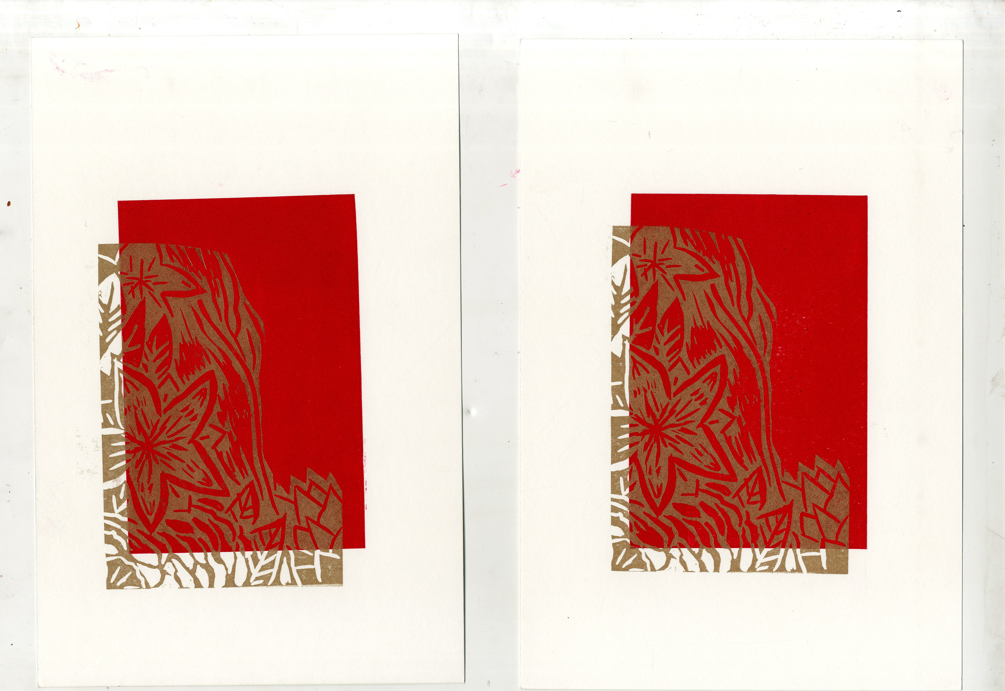
Red and gold prints
I chose to explore with varying the background also, by using a rectangle block background instead of the cornered off rectangle, like in the initial prints. I found to prefer the first background as it complemented the pattern more, as it wasn't too distracting from the main focus of the floral feature.
Experimenting different colour schemes, I chose to go with a deeper red ink and I felt it would go well with a golden accent. I really liked the golden ink outcome as it highlighted the decorative aspect of the design. Furthermore, subtly brighten up all the fine details well, which can sometimes be made dull according to the use of colour. Here the gold not only boldly showed the pattern but also contrasted well with the rich red. However, the dark background doesn't allow the strength of the golden pigments to be fully shown.
Therefore, I wanted to test with another background colour with the gold ink.