
The Children’s Cover Award 2020 brief asked to re-design a cover look for Goodnight Mister Tom to bring this unforgettable book to new readers and ensured that the novel remains as an important read for every child. Exploring the novel’s themes of compassion, friendship, loyalty and trust, I created a design inspired by the WWII propaganda posters.
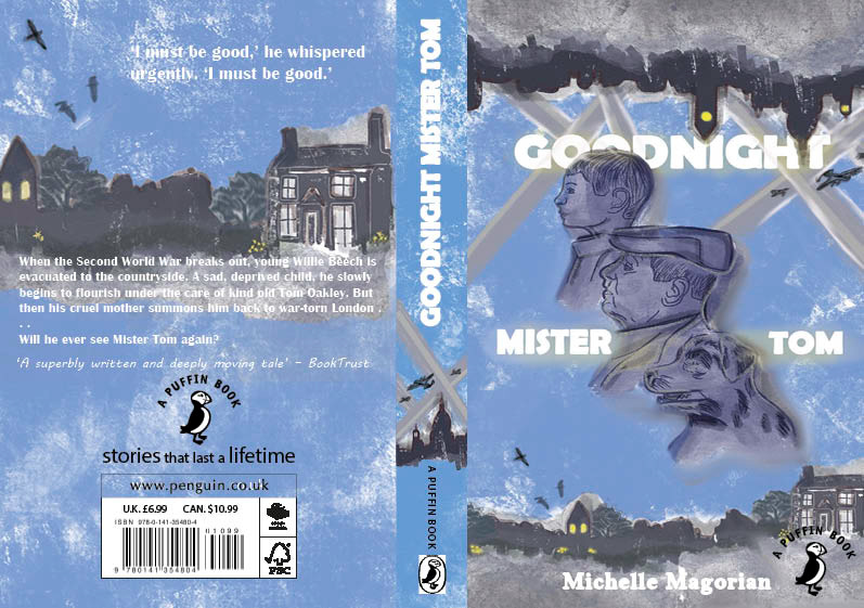
This was the composition that I entered as my interpretation of the Goodnight Mister Tom cover. I liked this style as I felt it executed the storyline well visually and clearly compared to the other layouts. As it already communicated the main three characters and provided the strong contrasts of the different settings within the novel. I placed William, the boy closer to the skyline of London to unconsciously tell the viewer what is displayed in the book that, the war time city is his background. While Mister Tom and Sammy are closer to the countryside. I focused on creating clear diagonal lines and bold visual elements as I was inspired to do so by the war poster research as I found these features made a powerful look.
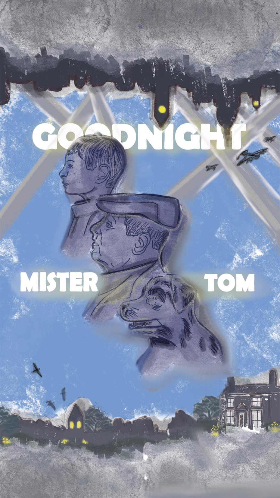
As my chosen design included the characters, I had to focus on how I wanted to portray the figures according to the book's description. I looked into quotation around both William and Tom, also Sammy the dog too. Afterwards I collected imagery that I felt captured the essence of their character the most to use as inspiration to help me depict their appearance.
My design includes both parts of the locations to show where the novel is set; London and in the countryside, Weirwold. I wanted to show the contrast between the wartime city and the refugee of the English's countryside. Again I used descriptions from the book to create a collage to represent the two sceneries and the harsh differences caused by the war. One side is seen with nature and a cosy atmosphere while the other as dark and ominous.